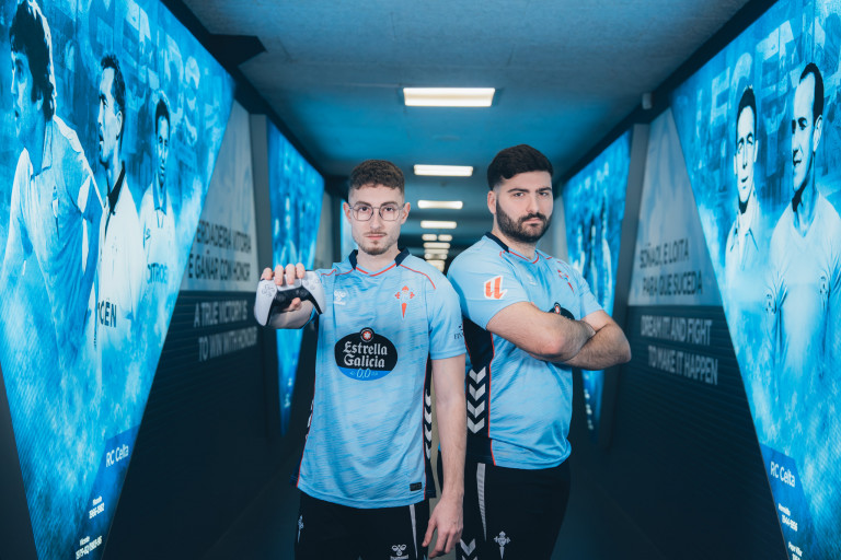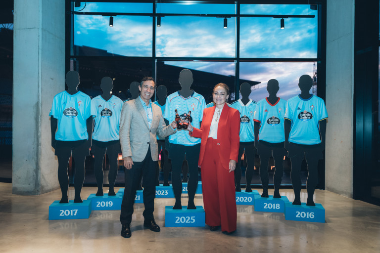
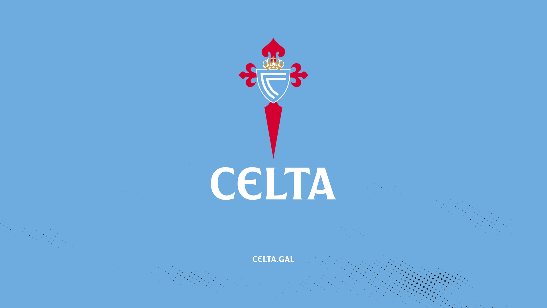
Celta takes a new step in its history with a brand update that reinforces its personality, delves into its roots, and projects its Galician and sky-blue identity with greater strength. From now on, the club will present itself simply as “Celta” in all brand-related communication spaces, coexisting with Real Club Celta, Celta de Vigo, or RC Celta as equally valid names.
This change responds to an evident reality: for fans, for the football world in general, we have always simply been Celta. Recognizing ourselves in this way is a way of recognizing our way of feeling and expressing ourselves—closer, more authentic.
The new identity keeps our crest intact, with only minor technical adjustments made to its design.
One of the main new features is the creation of the Sempre Celta typeface, developed specifically for the club. This new type family is inspired by Galician art, landscape, and tradition, and gives visual voice to our personality: proud, brave, and full of character.
The brand update work was carried out in collaboration with the branding consultancy agency Summa. The development of the Sempre Celta typeface was led by Pedro Arilla.
As part of this renewal process, the club will also adopt celta.gal as its new main web domain. In the coming weeks, all digital platforms will gradually migrate from the current rccelta.es to celta.gal, further solidifying Celta’s commitment to promoting the Galician language, culture, and identity in the digital sphere as well.
This evolution is a reaffirmation of our identity. More than just a new brand, it is a way of saying who we are, where we come from, and where we’re going.
Sempre Celta.